Author Archives: Jane Porter

Secret Rivers

I’m thrilled to have two pieces of work in the Museum of London Docklands’ current exhibition, Secret Rivers. My graphic novel, The Ghost Carp (inspired by fifteen years of river cleanups with the Wandle Trust) is in a glass case alongside Charles Dickens no less! And my Wandle Alphabet poster is also featured, together with an audio recording of me talking about the five-year process of finding all the letters. In the photo above, I am even wearing a necklace that came out of the river – you never know what you are going to find…

The exhibition is well worth a visit, and is on until 27th October. Admission is free.

Sheep on the beach!

I’ve been out on the road promoting Brian The Brave over the past few weeks – my new picture book with Paul Stewart, published in April by Otter Barry Books. I’ve done a couple of library visits, at Southfields and Northcote, where children really enjoyed participating with the sheep puppets. One girl got very attached to the wolf! I was sad to have to disappoint her…
Paul and I did a story time at The Book Nook in Paul’s hometown Hove, and afterwards took the sheep for a romp on the beach.

Brian the Brave

On April 4th my new book with Paul Stewart, Brian the Brave, will be published by Otter Barry Books. I’ve collaborated with Paul once before, on Wings!, and it was lovely to be asked to work with him again.

The new story is all about sheep – but it’s also about much more. Brian is a happy-go-lucky sheep munching grass, when he meets a new friend. All is well until more and more sheep arrive, and start forming cliques based on the colour of their wool and the shape of their horns – causing much sheep-based unhappiness all round.

Brian wanders off despondently, but a chance encounter with a wolf brings out the hero in him, and he persuades all the sheep to work together to defeat the fearsome predator.

All the illustrations are made from collage, using scraps that I painted and applied textures to – the scratchiness of the wolf comes from monoprint rubbed with a sticklebrick, and the colours range from gouache to household emulsion, ink and oil pastels. When I first saw the text, I asked Paul where he thought it should be set, and he said ‘Yorkshire’. I’m very fond of Yorkshire, so that was a good starting point for me, and I had fun sneaking in lots of wildlife such as lapwings, moths and red campion. You can read more about the process here.

It’s a great story to read out loud to young children – I’ve tested it on my under 5s art group and they were fascinated by which sheep was which. There’s a handy guide opposite the title page.

Brian The Brave will be published in the US later in the year by Flyaway Books, and is out now in Denmark as Marius den Modige!

New Hope

For the last few months I’ve been working on a very different sort of project – I’ve been illustrating a PhD. It’s part of the Creative Impacts programme at Kings College London, and I was very proud to be part of it through my collaboration with Dr Sharron Frood. We were paired up in October (one of 8 creative/academic pairings this year) and I made a concertina book as a visual interpretation of Sharron’s work on the plight of AIDS orphans in South Africa. Her research included lots of heartbreaking stories but also points the way forward for more joined-up care for these children, hence the title ‘New Hope’. An exhibition of all the Creative Impacts partnerships was held at Bush House in The Strand earlier in February – the subjects covered and means of interpretation are very diverse and inspiring. Thankyou Sharron for being so lovely to work with, and all the team at Kings for being so supportive.

Shed Job

This is a four page mini-comic I made about learning to play my great-grandfather’s fiddle. I’t been a very joyful process for me, although the story of the fiddle is a sad one. It feels appropriate to post this today, on the 100th anniversary of the Armistice, since it was my grandfather’s brother’s sad death right at the end of the war that silenced the fiddle for almost a century.

Shop window top tips

I’ve been lucky enough to be invited to illustrate two shop windows lately – the first at Sheen Bookshop, and the second at the House of Illustration. I’d never done one before, so I asked around amongst my illustrator friends and was given lots of good advice. So to return the favour in the future to anyone else who gets the opportunity (and to remind myself if I do some more), I thought I’d note down some tips.

  1. Ask the shop to send through a photo of the window. This gives you the chance to layer in some different design ideas in photoshop and see how they look in the correct proportions of the window. Keep different elements in different layers and move them around till it feels right.
  2. Print it out, and then flip it and print out again in reverse. This will help massively especially with text, as you will most likely be working from the inside for something to be seen from the outside so will be working in reverse.
  3. I used Posca pens, though I know some illustrators favour acrylics. The benefit of the Posca pens is they are so clean and easy to use – but the drawbacks are that they are expensive and don’t last long, and it’s hard to get large flat areas of colour (I solved this problem by smudging with a clean cloth immediately after applying the paint, then letting it dry, and then adding a covering of little marks. Looks good for fur but painstakingly slow! You can blend two colours eg. yellow and red to get an orangey effect, but you have to work really quickly with the blending cloth.
  4. The window will need to work both ways – from the inside and from the outside. One difficulty I found was that in bright light black tends to become almost invisible from the outside. I got around this as best I could by taking the infill colour right up to the edge of the black.
  5. Start with the black lines (if you’re using black that is) and give them a good half hour to dry really well. Blue by the way shows up really well from the outside.
  6. Have plenty of clean cloths or rags to wipe away any mistakes.
  7. Back to the pens – they come in many sizes. I found the 8mm chisel tips PC-8K were good, and also 4.5-5.5mm bullet tip (PC-7M). The 2 windows shown above used up the best part of two pink pens, and the yellow and white had pretty much run out too.
  8. Keep nipping outside to check how it’s looking.
  9. The Sheen Bookshop window took about 3 hours, the HOI one 4 hours.
  10. If you get a chance, go for it! The shops really appreciate it and it’s great promotion for your work, as well as fun to do. Good luck!

UPDATE!
In 2019 I did three windows for King Otter (thankyou Nomad Books, Pickled Pepper and Salt and Pepper cafe). This time I avoided any fill-in colour, which has several advantages: it looks cleaner and neater, it’s quicker to do and it doesn’t use up the Posca pens so fast. So I have definitely concluded that this is the way forward. I also avoided using any black at all, as I find it becomes almost invisible in this context. Bright colours like blue and pink work best. The other development was to use Posca pens of different sizes, so I had a few smaller-tipped ones for details (like the veins on the leaves or the dots on the flowers. Don’t forget you can practice on your windows at home.

I have been chatting on this topic with fellow illustrators and another tip I heard was to flip then print out your image/text LARGE then tape it to the outside of the window facing in – this gives you something to trace from (and can be re-used for future windows).

London landmarks

I’ve been back working with children on the ward and in the classroom at Evelina Children’s Hospital School. Together we made another big book, using collage and drawing, this time on a theme of London Landmarks. As always the children inspired me with their vision of an exuberant, colourful London, with a diverse crowd visiting the British Museum (top centre) and the royal barge Gloriana tackling some impressive waves.

Collage wildlife

I’ve got lots of exciting projects in the pipeline at the moment, which is a very nice way to begin 2018. The collage snippets shown above are from a picture book due for publication in 2019 with Otter Barry Books – ‘Brian The Brave’, written by Paul Stewart and illustrated by me. The main characters in this lovely story are sheep, but I won’t show those until nearer the publication date.

It’s great to be collaborating with Paul again (our previous picture book, ‘Wings!’, was published by Otter Barry Books in 2016) – and one of the things he suggested in his notes was that the landscape should look a bit like Yorkshire. I love Yorkshire so was delighted to oblige! I have been having fun putting together scenes with dry stone walls and abundant wildflowers such as meadowsweet, red campion, clover, buttercups and reed mace, and including favourite birds like lapwings and grey wagtails – and some damselflies for a scene including a pond.

Book promotion for the shy at heart

It’s been a busy summer, on a book tour to promote my new picture book, Pink Lion (Walker Books 2017). It’s the first time I’ve done anything like this on my own, so I thought now the last event is over, it might be useful to pull together what I’ve learned along the way. At least I can remind myself next time I have to do it, and maybe it will be useful to someone else as well.

I am naturally quite a shy person, so being the centre of attention doesn’t come naturally to me – but I have discovered that I can do it! In fact, I’ve really enjoyed all the events, meeting lovely bookshop people, parents and most of all children all over the place from Clapham Junction to Northumberland. One of my events was at the HUGE Apple Store in Regents Street for their Saturday Kids Hour. I’m glad I didn’t know in advance I would have to wear a microphone, but now I know I can do it – and it was amazing to see my Pink Lion animation on a screen the size of a double decker bus…

So here are my tips on book promotion for the shy (which I suspect is 99.9 per cent of all illustrators and quite a lot of authors too):

  1. Make yourself a prop – a puppet or a toy (or find someone who can make one for you). I somehow felt more confident having my velvet version of Arnold with me – and children love to give him a hug.
  2. Contact lots of shops and offer a storytime visit – once it’s in the diary, you have to do it. And it actually gets easier and easier.
  3. Have some ‘extras’ to leave behind – I bought a badge-maker a few years ago and it has been a great investment. This is the one I use.
  4. Practise, and work out how long it takes to read the story. Ask questions of the audience, get them involved. If you don’t mind drawing in public, ask if the bookshop has a flipchart. I use a wax crayon to draw and pastel chalks to colour, and children love to help with the colouring in. 45 minutes is a good length (no longer) for a picture book age audience.
  5. Have another activity for after the story – for Pink Lion I have three different colouring/activity sheets which have a mix of things to colour and space for bits children can make up themselves. The better prepared you are, the less nerve-racking. Audiences can be very big or very small – you never know, so be prepared for both and don’t worry if it’s smaller. It’s more intimate that way, which is nice as a change.
  6. Be prepared for noisy babies and other distractions – it’s OK to pause for a while.
  7. Speak slowly.
  8.  Enjoy it – and don’t forget a Sharpie to sign books afterwards.

A huge thankyou to all the places that have hosted me and Arnold over the last few months: Waterstones Clapham Junction, Queens Park Bookshop, Sheen Bookshop, Southfields Library, Heffers Cambridge, Forum Books Corbridge, the Apple Store Regents Street, Nomad Books Fulham, and Tales on Moon Lane in Herne Hill.

And an extra special thankyou to the places that made window displays! Thankyou Forum Books, Queens Park Books, Heffers and Salt and Pepper, the nicest cafe in Soutfhields.

“It needs more roaring”

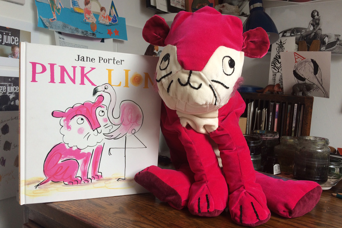
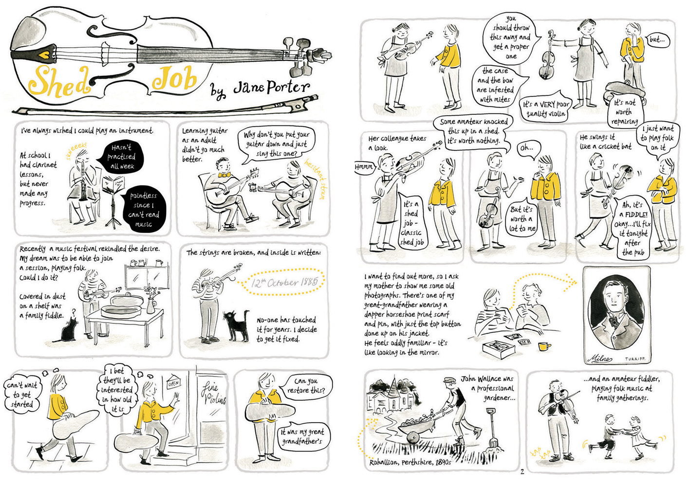
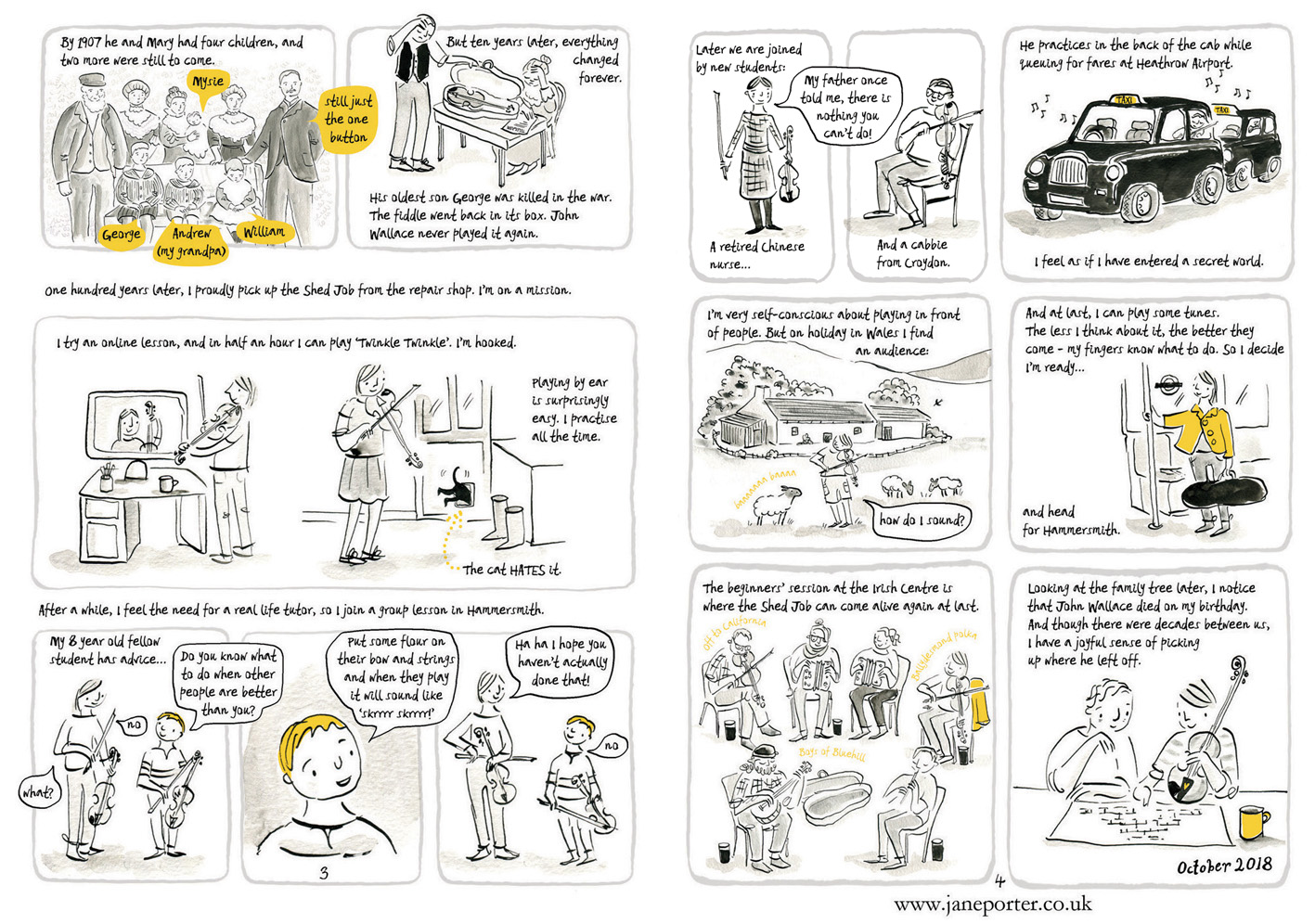
My new picture book Pink Lion is published next month by Walker Books. This is the story of how it came into being…

Once a week I run an art class for under 5s. It’s a great joy to watch the creativity of young minds and fingers – and a constant source of inspiration to me. This was never more true than the week we made robots. After constructing our shiny cardboard creations, I asked the group what they thought the story might be about today. “A pink lion,” said one boy, without hesitation.

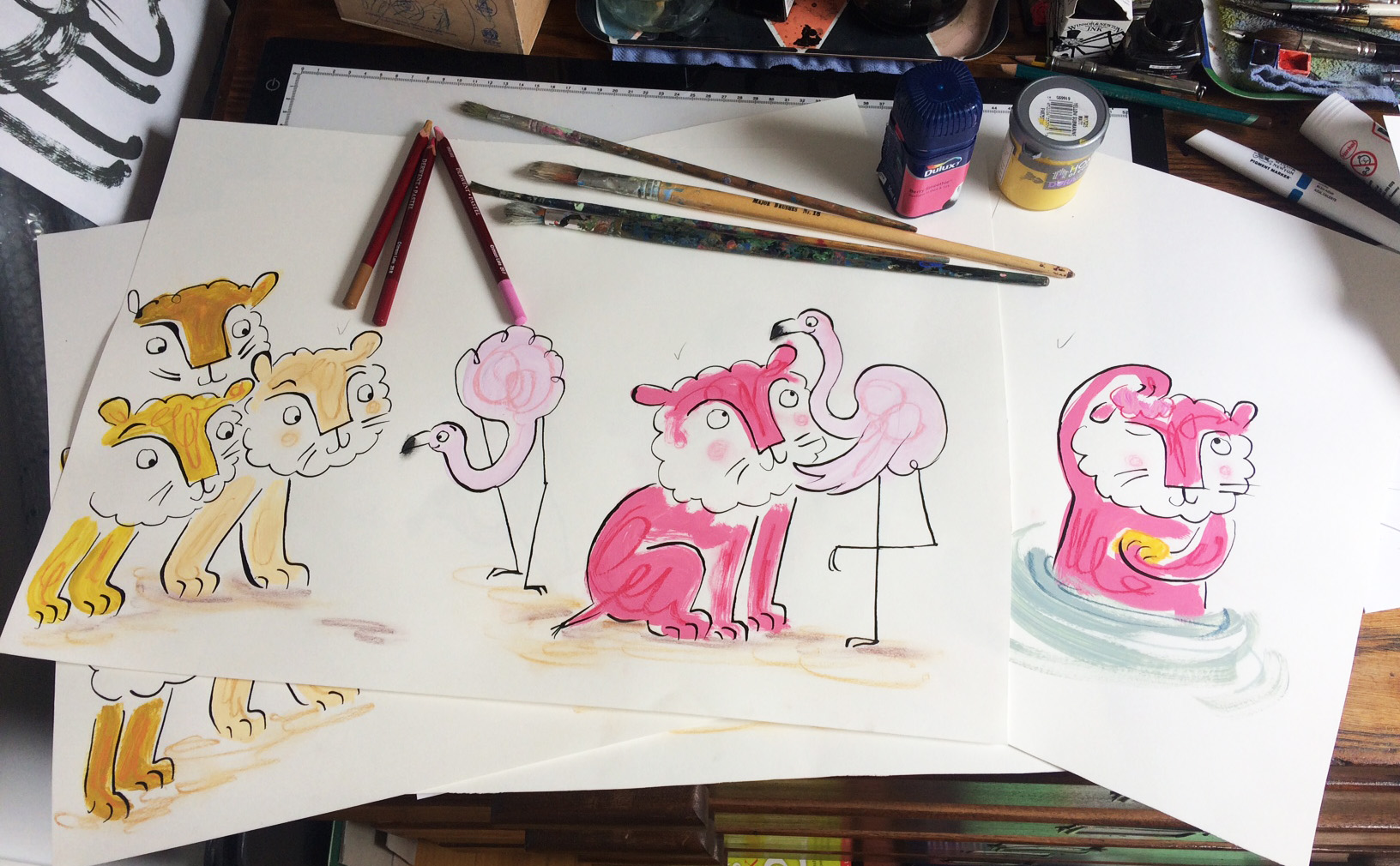
That was the spark that set me pondering, scribbling and scouring museums for stone lions (the Ashmolean Museum in Oxford has a particularly fine one in pink granite). Brainstorming pink things put flamingoes in my mind, and I liked the idea that a pink lion might be adopted by pink birds and live a happy life with jelly for tea every day. For some reason it seemed natural to call him Arnold.

This didn’t offer much drama, however, which is where the growling gang of yellow lions comes in, sending Arnold into a state of confusion about his identity. The story was shaping up, and I made a series of small dummy books with all sorts of endings – in one, Arnold raced round making cold drinks for the lazy lions, in another he went home to find the flamingoes had formed a stunt motorbike troupe.

I took the latest version on a camping trip to Wales, and one wet afternoon when there wasn’t much else to do I read it out to a friend’s little boy. His feedback was concise, and pinpointed the problem with dazzling accuracy – “It needs more roaring”. And that’s when the very nasty crocodile came in, putting flamingoes in peril and letting Arnold discover his inner roar.

The story was coming together – now for the artwork. “Make it look as if it took five minutes” said my editors at Walker Books. It took about two years to make it look as if it took five minutes. I tried every material under the sun – coloured pencil, collage, gouache, ink. None of the pinks felt right, and they seemed to clash with the yellows horribly. One day I was browsing a book about Picasso, and noticed ‘household emulsion’ in the list of materials he used. That’s when it clicked – I bought a sack of tester pots from Homebase, with delightful names like Yellow Submarine and Berry Smoothie. I applied them with the worst brushes I could find, added a scribble of pastel pencil, then pen and Indian Ink for the details – and finally I had something I was happy with.

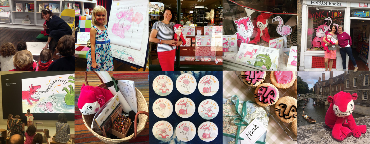
Now the book is finished, and will be out in the shops in just four weeks. I’ll be visiting bookshops to do some storytelling and signing – and it’s the first time I will have done this without an author. So that I’ve got someone to travel with, I have made myself a pink velvet soft toy version of Arnold – he’s a proper luxury lion with THREE types of pink velvet from his inner ears to his paw pads, and raspberry mohair for his scribble cheeks. I’ve stitched little bags of baking beans into his paws, which gives him just the right amount of weight to be able to sit up on his own. We are looking forward to touring together! Although our family cat is rather jealous.